Why did I love working on this project and what did I learn?
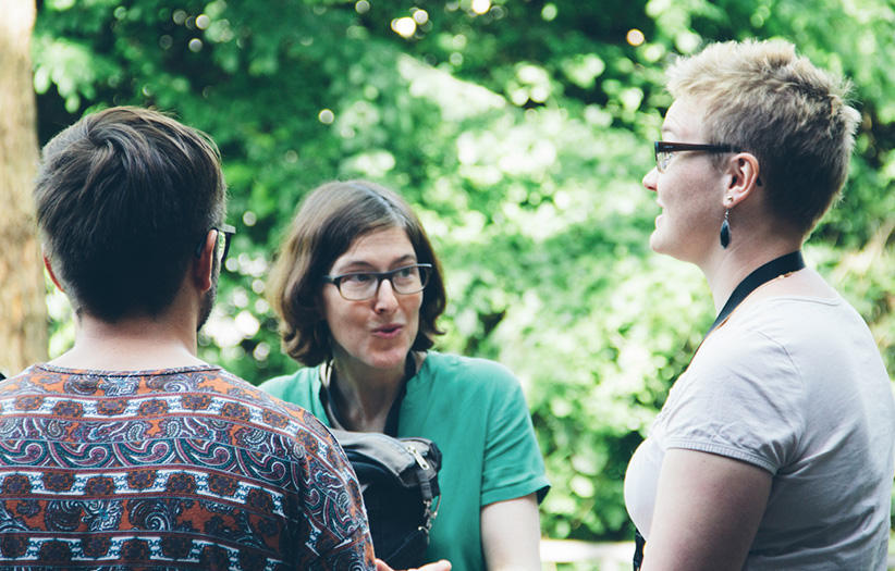
Redesigning a digital experience which many people use daily was a challenging project to work on. I did the field study with the information architect and we spent a lot of time at the local railway station in Zurich to interview passengers. Leaving the office and talking to people about their needs and wishes was essential. We worked agile, so we could do collaborative troubleshooting and got the opportunity to learn with each new iteration. I enjoyed playing an active part in the project team, collaborating and discussing prototypes with frontend developers. The testing helped us to learn from mistakes fast and adapt as necessary. One of my main tasks was to ensure that the design specifications are implemented. I covered for the art director for one month of absence which taught me what it means to take on more responsibility.
Client
Zurich Transport Network
Agency
Unic AG, Zurich
Team
9 amazing people
My Responsibility
Field Study, Research, Art Direction (cover for 1-month absence), Visual Design, UI/UX Design, UX Strategy, Prototyping
Achievements
– Representation of the art director during absence
– 8,240,000 sold e-tickets per year
– Annual Multimedia Award Silver for Website & Portal
– Best of Swiss Web Award Silver for Public Affairs
Link
Zurich Transport Network Website
– The journey from the
challenge to the solution
With over 600 million passengers a year, ZVV is the largest public transport network in Switzerland. The challenge was to create a concept which includes all groups of passengers – no matter what age. This includes commuters, the youth which uses transport to get home from a night out as well as senior citizens. In order to cover the different interests and needs the new site offers an intuitive approach with an easy and flat navigation.
A map makes
the available connections easier to understand.
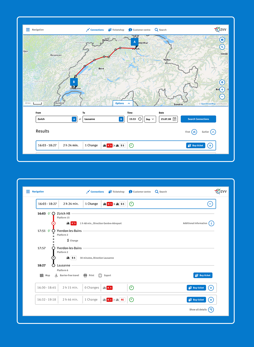
The look and feel is modern, clean and light. The white background allows a strong contrast which supports increased readability. The ZVV blue was used to set highlights and guide the user through the experience. The iconography helps to break the language barriers.
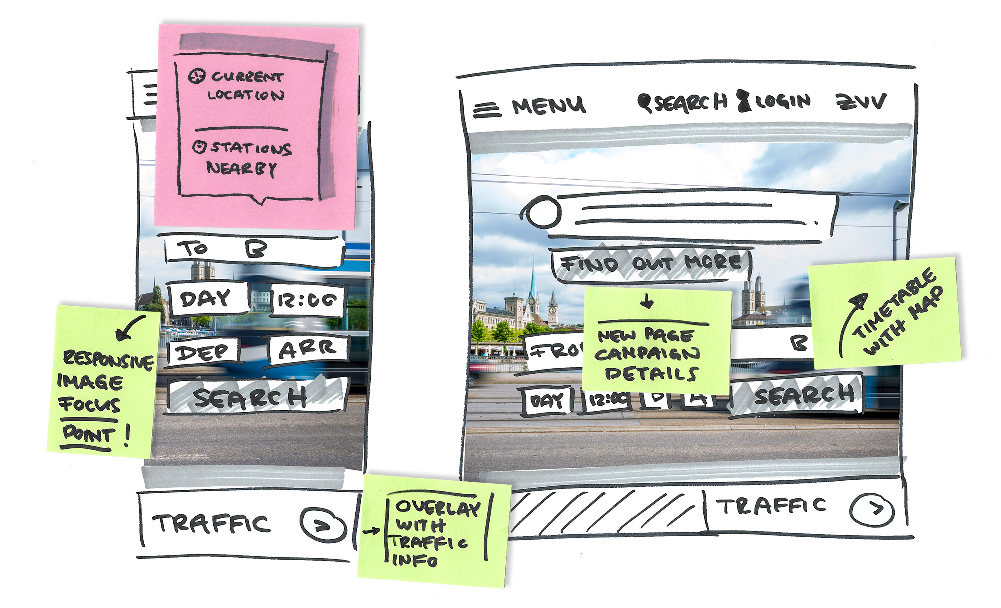
Access everywhere –
no matter if at home
or along the way
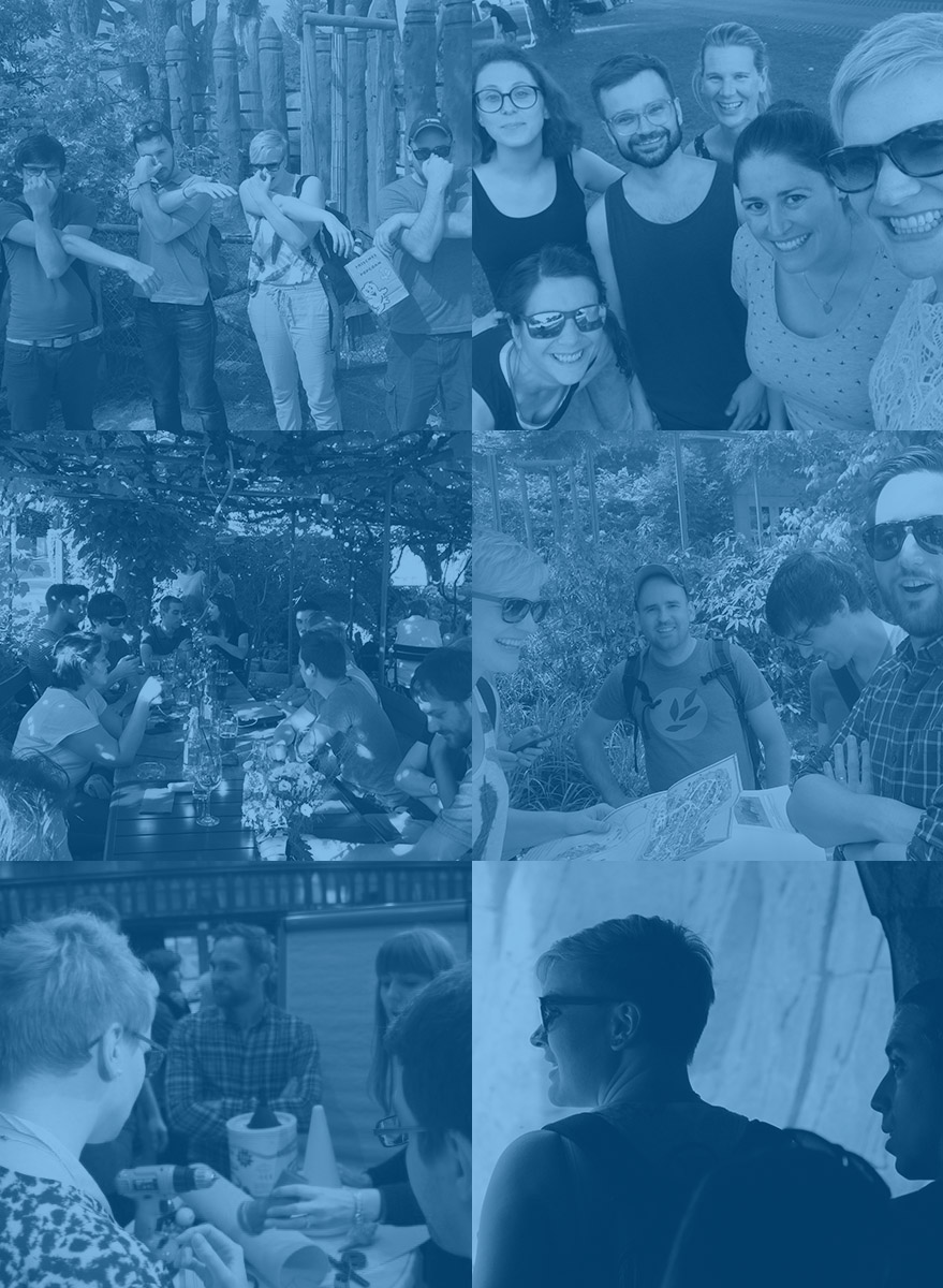
The whole team met every two weeks for a sprint meeting to discuss the progress and make relevant decisions.
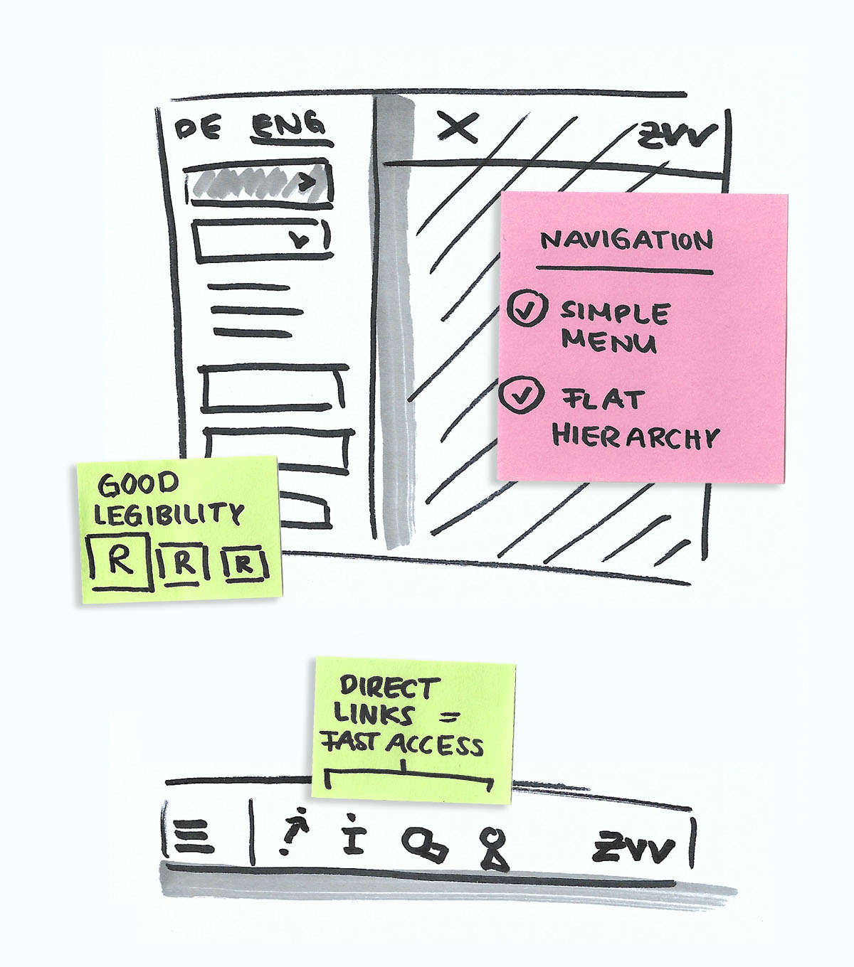
A flat hierarchy as well as a menu which is easy to navigate make the website more accessible for everyone. A special focus was on good legibility to make the experience barrier-free.
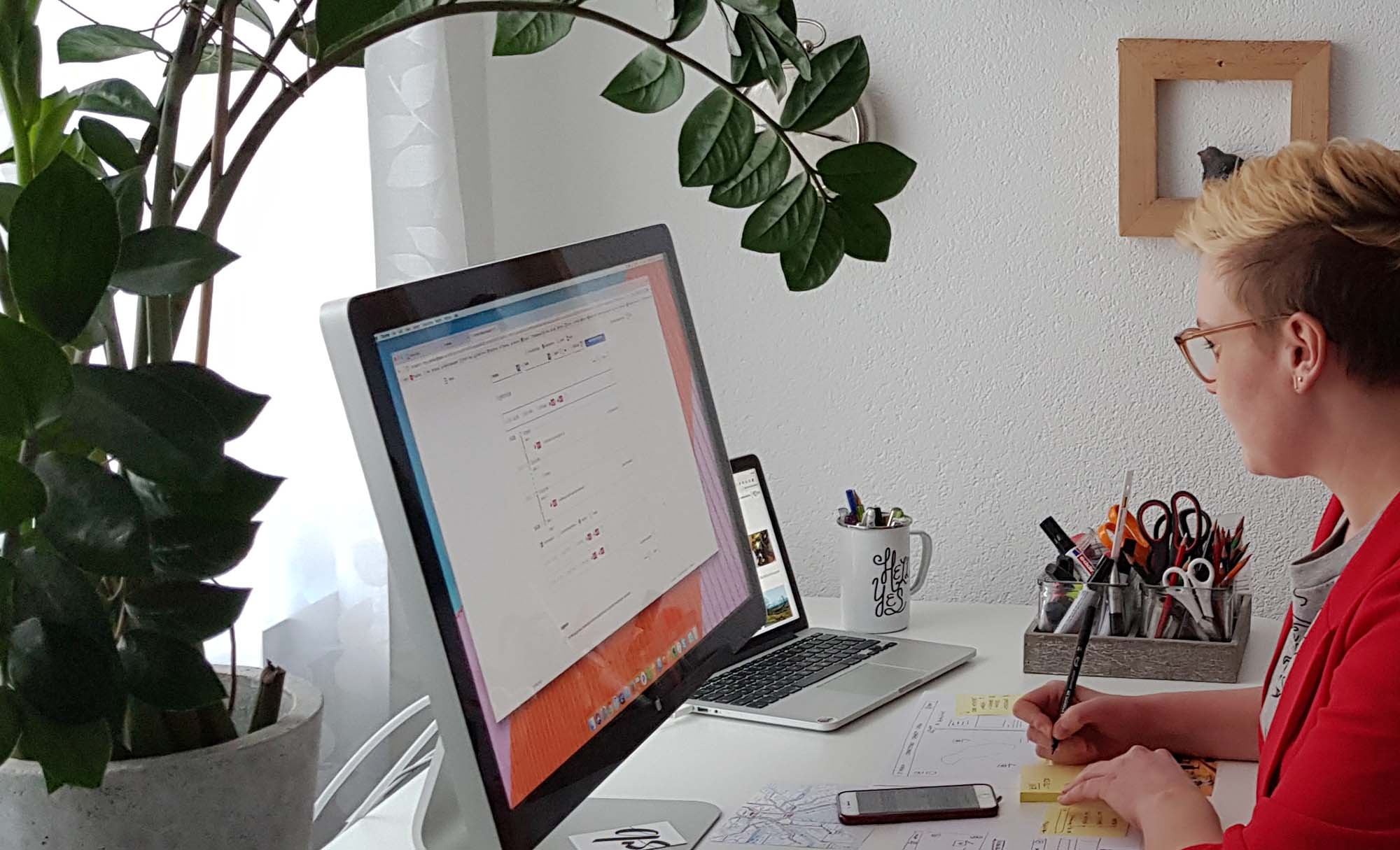
The concept came alive through interviews, creative workshops and teamwork.
Explore more projects
Want to say hello? Instagram | Linkedin | Send a message or leave a message after the beep
© 2023 Stephi Batliner

