Why did I love working on this project
and what did I learn?
This project taught me the challenges of remote work. It showed me how essential daily communication is in order for everyone to be on the same page. As the first designer on the team, I invested a lot of time to convince my co-workers about the relevance of design and how we can create an impactful design concept. I learned how to find creative solutions within a low budget and how to juggle design and content management at once. This project has strengthened my passion for health and social design. I enjoyed learning about health-related topics as much as collaborating with diverse people.
Client
GIANT Health Events
Agency
Freelance
Humans
Barry – Founder
Stephanie – Designer & Content Manager
Alex – Marketing Manager
Konrad – Frontend Developer
Mariusz – Project Manager
My Responsibility
Design Strategy, Web Design, Visual Design, UI/UX Design,
Prototyping, Image Research, Content Management
Achievements
– Brand consistency
– Simple workflow
– More website visitors and increased ticket sale
– Improved social media interaction
– The journey from the
challenge to the solution
The main challenge was to redesign the current website within a short amount of time and with a low budget. Our goal was to make the website more accessible, cover all the needs of the different target audiences and automate application processes for speakers, exhibitors, volunteers and so on. Also, it was essential to create a unique selling point. Therefore, I collaborated closely with the Founder of GIANT Health Events and other team members.
As a new USP, a strong search and a hidden tagging allow creating unique result pages for any health-related topic.
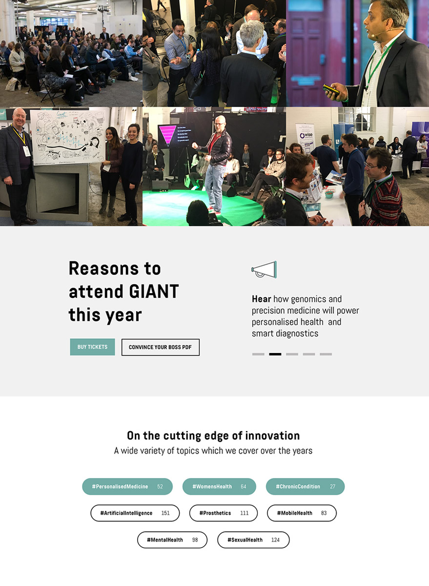
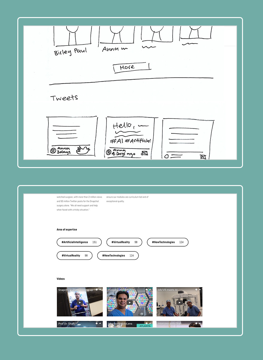
In the research phase, I found that the past two events have covered diverse topics and some well known speakers presented at the events. The conference usually has to main goals one is to network and meet new people and the other one is to exchange knowledge and learn something new. This is how the idea for a new website feature started. Through using a tag system in the back end all the content for example connected to the search of "artificial intelligence" could be pulled together. The result shows videos/articles/tweets related to the keyword, past and future speakers who have knowledge about the topic and so on.
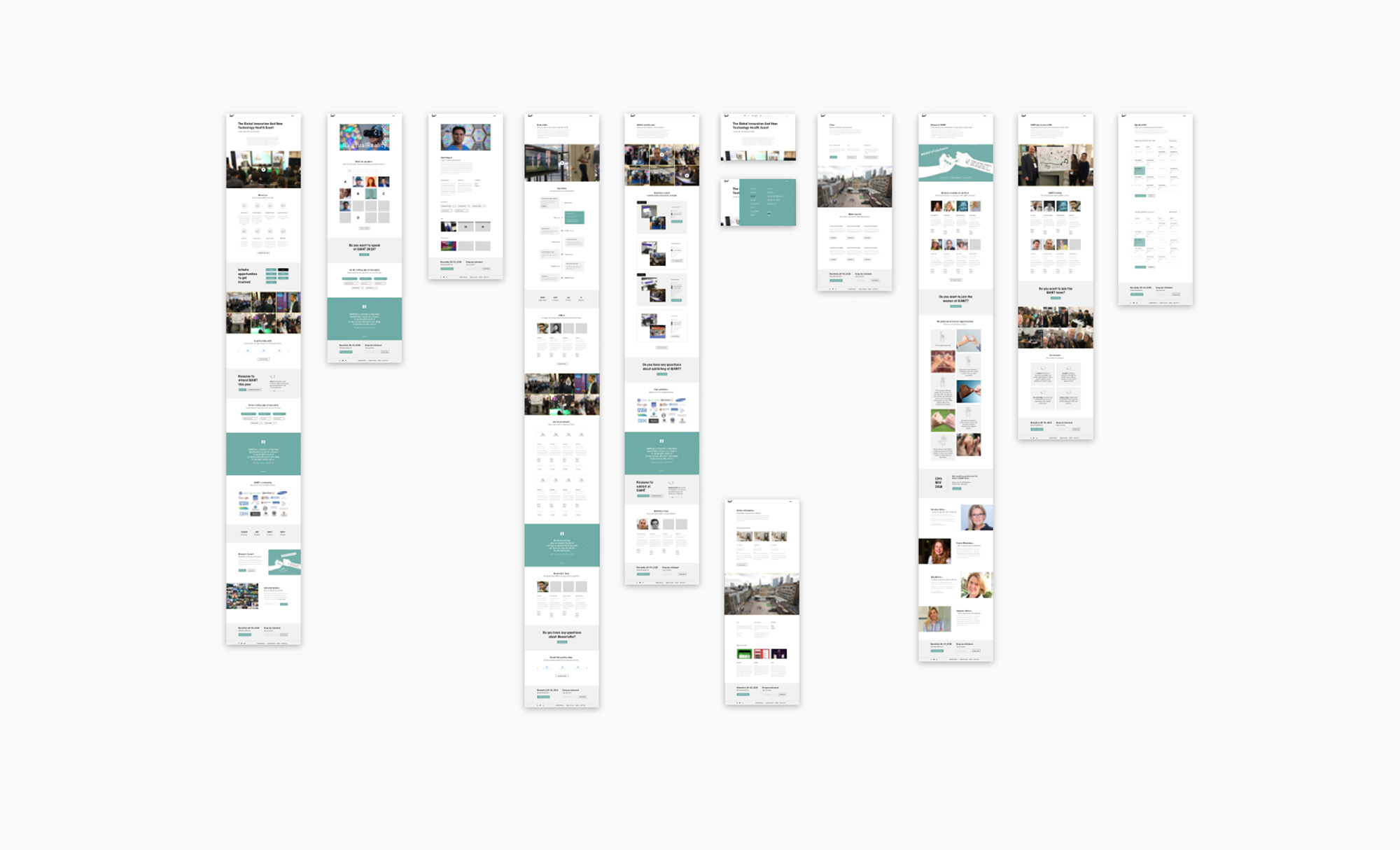
The navigation is designed with active keywords like "speak", "attend", "pitch" and encourages the user to take action.
Every page is customised for a specific target audience: Attendees, exhibitors, sponsors, volunteers.
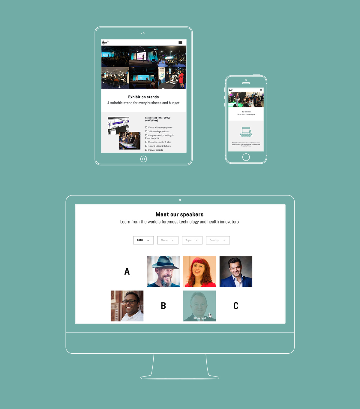
Since there was a limited amount of existing content, I took on the task of writing and managing content as well as doing image research. I strongly believe in designing with real content instead of placeholder text because issues can be found way earlier. At the end of the design process and after some iterations, I did the quality management and also checked the technical implementation of the back end.
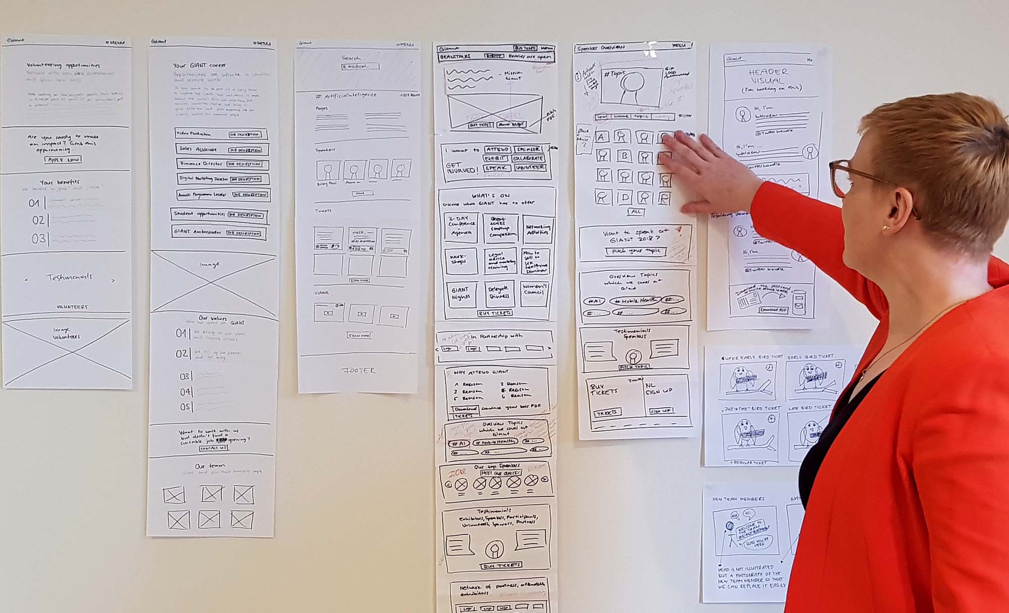
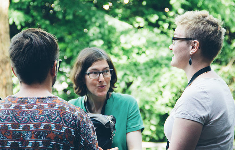
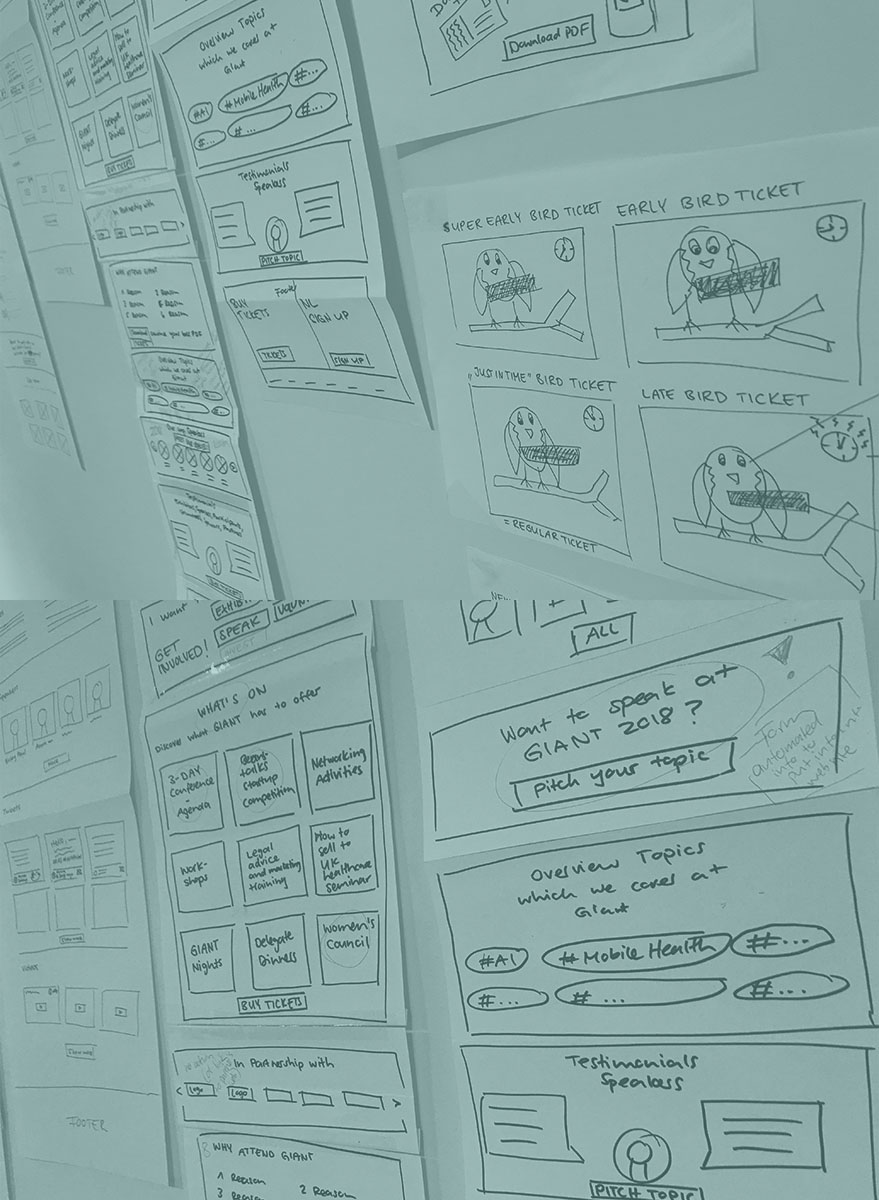
Workshop to pitch and discuss the wireframes as well as proof of concept.
Explore more projects
Want to say hello? Instagram | Linkedin | Send a message or leave a message after the beep
© 2023 Stephi Batliner

